

Designing a scalable system for consistent product interfaces
Overview
As the product evolved, inconsistencies across components and patterns slowed workflows and fragmented experiences. Teams often rebuilt similar elements, causing duplication and inefficiencies. Even simple decisions required repeated effort, so this case study focuses on creating a unified design system that standardizes components, streamlines workflows, and ensures a scalable, consistent foundation.
Manual Effort
Reduced duplication by introducing reusable components and shared design patterns
System Consistency
Established a unified visual and interaction language across the product
Role
End-to-End Design System, UX Strategy
Tools


Contributors

Problem
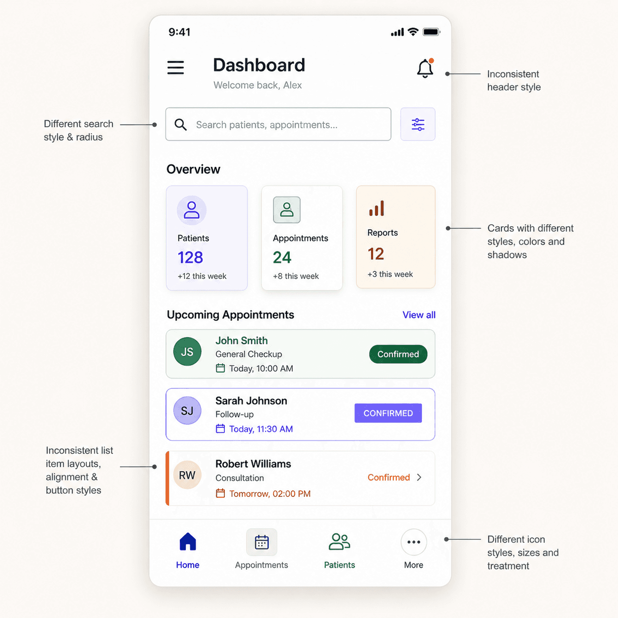
The product didn’t lack features, but lacked a system to support them consistently
As the product evolved, interfaces were built independently, leading to inconsistencies across components, patterns, and interaction behaviors. Without a shared system, similar elements were recreated repeatedly, increasing design effort and slowing development velocity. Visual structure, spacing, and interaction logic varied across screens, creating fragmented user experiences and making the product harder to scale. Over time, this absence of standardization reduced efficiency, introduced inconsistencies, and limited the ability to build and maintain the product reliably.

Goals & Principles
Defined clear system principles to eliminate inconsistencies, reduce duplication, and enable faster product decisions across teams
01
Consistency over variation
Interfaces follow a unified structure across components, spacing, and typography, ensuring a cohesive experience and reducing visual and interaction inconsistencies across the product.
02
Reuse over recreation
Components are designed to be reusable and adaptable, minimizing duplication and reducing the need to rebuild similar UI patterns across different flows and features.
03
Systems over dependency
Clear patterns and guidelines replace reliance on individual decisions, enabling teams to design, build, and scale features without constant coordination or re-alignment.
System Scale & Coverage
A scalable system built to support consistency, reuse, and rapid product development
700+
Design tokens & global styles
A unified foundation of colors, typography, spacing, elevation, and grids that ensures consistency and reduces ambiguity across all product interfaces.
1350+
Components & variants
A structured component library with reusable patterns, flexible variants, and responsive behaviors designed to support diverse use cases at scale.
200+
Icon system
A consistent and scalable icon set designed for clarity and alignment, ensuring visual harmony and seamless integration across different interfaces.
Foundation
The core building blocks of Pixxels—designed for clarity, consistency, and scalability. Each foundation ensures predictable behavior, strong hierarchy, and a unified visual language across the system.

Token-driven foundations
All core styles—colors, typography, spacing, and elevation—are defined through tokens, enabling consistent theming and effortless global updates.

Semantic color system
A meaningful, role-based color structure that supports accessibility, predictable interactions, and visual harmony across components.

Scalable typography system
A clear, flexible type scale designed for hierarchy, readability, and balanced line structure across various screen sizes.

Responsive grid layouts
A multi-breakpoint grid system that ensures clean alignment, predictable spacing, and scalable layout patterns across desktop, tablet, and mobile.
Foundation Library
The core style framework that shapes the system’s visual identity.

Colors
A balanced palette with semantic roles and adaptable variables.
148 Styles

Typography
Readable type scale designed for hierarchy, accessibility, and product use.
80 Styles

Icons
Phosphor Icons integrated for clarity, flexibility, and consistency.
200+ Icons

Elevation
Lightweight elevation levels for subtle depth and visual hierarchy.
320 Styles

Spacing
A predictable spacing system using a consistent scale for layout harmony.
22 Styles
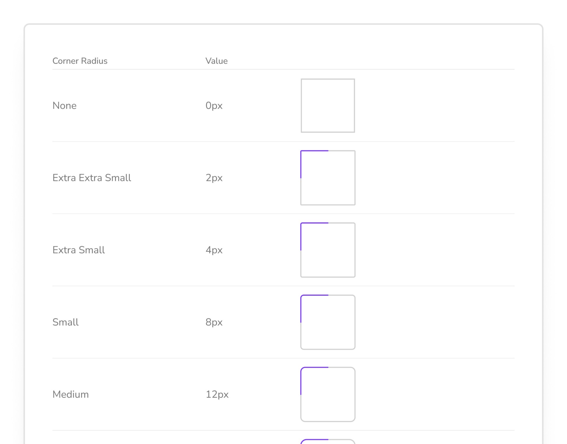
Corner Radius
A unified radius scale for cohesive component styling.
12 Styles

Grids & Layout
Flexible grid templates for responsive structure and alignment.
22 Layouts & 3 Grids
Component
Reusable building blocks of Pixxels—designed for clarity, flexibility, and quick implementation. Each component includes practical variants, defined states, and intuitive properties for consistent, efficient UI creation.

Smart Properties
Components are built with intuitive properties that simplify customization—making it easy to toggle icons, update states, change alignment, or swap content with minimal effort.

Interaction states for prototyping
All interactive components include hover, focus, pressed, and disabled states, enabling more realistic, predictable behaviour within prototypes and user flows.

Auto-layout enabled
Every component uses Figma’s Auto Layout for responsive resizing, consistent spacing, and smooth adaptation across layouts and breakpoints.
Consistent anatomy
All components follow the same internal structure—clear spacing, uniform padding, consistent radius, and balanced hierarchy—ensuring visual harmony throughout the system.

Token-driven design
Color, typography, spacing, and elevation tokens define the foundation of each component, making global updates effortless and maintaining consistency across the entire UI.

Variant-rich components
Each component includes well-structured variants that adapt naturally across different scenarios, allowing designers to switch patterns quickly without manual adjustments.
Component Library
A structured library of advanced UI components.

Alerts
Provides contextual feedback messages for success, warning, error, and informational states.
80 Variants

Avatar
Displays user representation with support for images, initials, status indicators, and group stacking.
45 Variants

Buttons
Interactive elements used to trigger actions, with variants for hierarchy, emphasis, and icon support.
80 Variants

Check Box
Allows users to select one or multiple options, with clear states for checked, unchecked, and indeterminate.
50 Variants
Chips
Compact UI elements used for selection, filtering, tagging, or displaying small bits of information.
56 Variants

Date Picker
Enables users to select a specific date or date range with an intuitive calendar interface.
34 Variants

Dropdown
Provides a collapsible list of selectable options, supporting single and multi-select patterns.
62 Variants
250+ Components & 1000+ Variants
Interactive States
Interactive components adjust their appearance based on user actions, providing clear and intuitive feedback during prototyping.

Overall Impact
Design Inconsistency
Reduced variation across components, layouts, and interactions throughout the product
System
Consistency
Consultation Pace
Unified patterns and components create a cohesive and predictable user experience
Duplicate Effort
Duplicate
Effort
Operational Gaps
Minimized repeated design and development work across teams and features
Faster Execution
Reusable components enable quicker design, development, and iteration cycles
More Works
(GQ® — 02)
©2024


Designing a scalable system for consistent product interfaces
Overview
As the product evolved, inconsistencies across components and patterns slowed workflows and fragmented experiences. Teams often rebuilt similar elements, causing duplication and inefficiencies. Even simple decisions required repeated effort, so this case study focuses on creating a unified design system that standardizes components, streamlines workflows, and ensures a scalable, consistent foundation.
Manual Effort
Reduced duplication by introducing reusable components and shared design patterns
System Consistency
Established a unified visual and interaction language across the product
Role
End-to-End Design System, UX Strategy
Tools
Contributors
Problem
The product didn’t lack features, but lacked a system to support them consistently
As the product evolved, interfaces were built independently, leading to inconsistencies across components, patterns, and interaction behaviors. Without a shared system, similar elements were recreated repeatedly, increasing design effort and slowing development velocity. Visual structure, spacing, and interaction logic varied across screens, creating fragmented user experiences and making the product harder to scale. Over time, this absence of standardization reduced efficiency, introduced inconsistencies, and limited the ability to build and maintain the product reliably.
Goals & Principles
Defined clear system principles to eliminate inconsistencies, reduce duplication, and enable faster product decisions across teams
01
Consistency over variation
Interfaces follow a unified structure across components, spacing, and typography, ensuring a cohesive experience and reducing visual and interaction inconsistencies across the product.
02
Reuse over recreation
Components are designed to be reusable and adaptable, minimizing duplication and reducing the need to rebuild similar UI patterns across different flows and features.
03
Systems over dependency
Clear patterns and guidelines replace reliance on individual decisions, enabling teams to design, build, and scale features without constant coordination or re-alignment.
System Scale & Coverage
A scalable system built to support consistency, reuse, and rapid product development
700+
Design tokens & global styles
A unified foundation of colors, typography, spacing, elevation, and grids that ensures consistency and reduces ambiguity across all product interfaces.
1350+
Components & variants
A structured component library with reusable patterns, flexible variants, and responsive behaviors designed to support diverse use cases at scale.
200+
Icon system
A consistent and scalable icon set designed for clarity and alignment, ensuring visual harmony and seamless integration across different interfaces.
Foundation
The core building blocks of Pixxels—designed for clarity, consistency, and scalability. Each foundation ensures predictable behavior, strong hierarchy, and a unified visual language across the system.
Token-driven foundations
All core styles—colors, typography, spacing, and elevation—are defined through tokens, enabling consistent theming and effortless global updates.
Semantic color system
A meaningful, role-based color structure that supports accessibility, predictable interactions, and visual harmony across components.
Scalable typography system
A clear, flexible type scale designed for hierarchy, readability, and balanced line structure across various screen sizes.
Responsive grid layouts
A multi-breakpoint grid system that ensures clean alignment, predictable spacing, and scalable layout patterns across desktop, tablet, and mobile.
Foundation Library
The core style framework that shapes the system’s visual identity.
Colors
A balanced palette with semantic roles and adaptable variables.
148 Styles
Typography
Readable type scale designed for hierarchy, accessibility, and product use.
80 Styles
Icons
Phosphor Icons integrated for clarity, flexibility, and consistency.
200+ Icons
Elevation
Lightweight elevation levels for subtle depth and visual hierarchy.
320 Styles
Spacing
A predictable spacing system using a consistent scale for layout harmony.
22 Styles
Corner Radius
A unified radius scale for cohesive component styling.
12 Styles
Grids & Layout
Flexible grid templates for responsive structure and alignment.
22 Layouts & 3 Grids
Component
Reusable building blocks of Pixxels—designed for clarity, flexibility, and quick implementation. Each component includes practical variants, defined states, and intuitive properties for consistent, efficient UI creation.
Smart Properties
Components are built with intuitive properties that simplify customization—making it easy to toggle icons, update states, change alignment, or swap content with minimal effort.
Interaction states for prototyping
All interactive components include hover, focus, pressed, and disabled states, enabling more realistic, predictable behaviour within prototypes and user flows.
Auto-layout enabled
Every component uses Figma’s Auto Layout for responsive resizing, consistent spacing, and smooth adaptation across layouts and breakpoints.
Consistent anatomy
All components follow the same internal structure—clear spacing, uniform padding, consistent radius, and balanced hierarchy—ensuring visual harmony throughout the system.
Token-driven design
Color, typography, spacing, and elevation tokens define the foundation of each component, making global updates effortless and maintaining consistency across the entire UI.
Variant-rich components
Each component includes well-structured variants that adapt naturally across different scenarios, allowing designers to switch patterns quickly without manual adjustments.
Component Library
A structured library of advanced UI components.
Alerts
Provides contextual feedback messages for success, warning, error, and informational states.
80 Variants
Avatar
Displays user representation with support for images, initials, status indicators, and group stacking.
45 Variants
Buttons
Interactive elements used to trigger actions, with variants for hierarchy, emphasis, and icon support.
80 Variants
Check Box
Allows users to select one or multiple options, with clear states for checked, unchecked, and indeterminate.
50 Variants
Chips
Compact UI elements used for selection, filtering, tagging, or displaying small bits of information.
56 Variants
Date Picker
Enables users to select a specific date or date range with an intuitive calendar interface.
34 Variants
Dropdown
Provides a collapsible list of selectable options, supporting single and multi-select patterns.
62 Variants
250+ Components & 1000+ Variants
Interactive States
Interactive components adjust their appearance based on user actions, providing clear and intuitive feedback during prototyping.
Overall Impact
Design Inconsistency
Reduced variation across components, layouts, and interactions throughout the product
System
Consistency
Consultation Pace
Unified patterns and components create a cohesive and predictable user experience
Duplicate Effort
Operational Gaps
Minimized repeated design and development work across teams and features
Faster Execution
Reusable components enable quicker design, development, and iteration cycles
More Works
©2024
Designing a scalable system for consistent product interfaces
Overview
As the product evolved, inconsistencies across components and patterns slowed workflows and fragmented experiences. Teams often rebuilt similar elements, causing duplication and inefficiencies. Even simple decisions required repeated effort, so this case study focuses on creating a unified design system that standardizes components, streamlines workflows, and ensures a scalable, consistent foundation.
Manual Effort
Reduced duplication by introducing reusable components and shared design patterns
System Consistency
Established a unified visual and interaction language across the product
Role
End-to-End Design System, UX Strategy
Tools
Contributors
Problem
The product didn’t lack features, but lacked a system to support them consistently
As the product evolved, interfaces were built independently, leading to inconsistencies across components, patterns, and interaction behaviors. Without a shared system, similar elements were recreated repeatedly, increasing design effort and slowing development velocity. Visual structure, spacing, and interaction logic varied across screens, creating fragmented user experiences and making the product harder to scale. Over time, this absence of standardization reduced efficiency, introduced inconsistencies, and limited the ability to build and maintain the product reliably.
Goals & Principles
Defined clear system principles to eliminate inconsistencies, reduce duplication, and enable faster product decisions across teams
01
Consistency over variation
Interfaces follow a unified structure across components, spacing, and typography, ensuring a cohesive experience and reducing visual and interaction inconsistencies across the product.
02
Reuse over recreation
Components are designed to be reusable and adaptable, minimizing duplication and reducing the need to rebuild similar UI patterns across different flows and features.
03
Systems over dependency
Clear patterns and guidelines replace reliance on individual decisions, enabling teams to design, build, and scale features without constant coordination or re-alignment.
System Scale & Coverage
A scalable system built to support consistency, reuse, and rapid product development
700+
Design tokens & global styles
A unified foundation of colors, typography, spacing, elevation, and grids that ensures consistency and reduces ambiguity across all product interfaces.
1350+
Components & variants
A structured component library with reusable patterns, flexible variants, and responsive behaviors designed to support diverse use cases at scale.
200+
Icon system
A consistent and scalable icon set designed for clarity and alignment, ensuring visual harmony and seamless integration across different interfaces.
Foundation
The core building blocks of Pixxels—designed for clarity, consistency, and scalability. Each foundation ensures predictable behavior, strong hierarchy, and a unified visual language across the system.
Token-driven foundations
All core styles—colors, typography, spacing, and elevation—are defined through tokens, enabling consistent theming and effortless global updates.
Semantic color system
A meaningful, role-based color structure that supports accessibility, predictable interactions, and visual harmony across components.
Scalable typography system
A clear, flexible type scale designed for hierarchy, readability, and balanced line structure across various screen sizes.
Responsive grid layouts
A multi-breakpoint grid system that ensures clean alignment, predictable spacing, and scalable layout patterns across desktop, tablet, and mobile.
Foundation Library
The core style framework that shapes the system’s visual identity.
Colors
A balanced palette with semantic roles and adaptable variables.
148 Styles
Typography
Readable type scale designed for hierarchy, accessibility, and product use.
80 Styles
Icons
Phosphor Icons integrated for clarity, flexibility, and consistency.
200+ Icons
Elevation
Lightweight elevation levels for subtle depth and visual hierarchy.
320 Styles
Spacing
A predictable spacing system using a consistent scale for layout harmony.
22 Styles
Corner Radius
A unified radius scale for cohesive component styling.
12 Styles
Grids & Layout
Flexible grid templates for responsive structure and alignment.
22 Layouts & 3 Grids
Component
Reusable building blocks of Pixxels—designed for clarity, flexibility, and quick implementation. Each component includes practical variants, defined states, and intuitive properties for consistent, efficient UI creation.
Smart Properties
Components are built with intuitive properties that simplify customization—making it easy to toggle icons, update states, change alignment, or swap content with minimal effort.
Interaction states for prototyping
All interactive components include hover, focus, pressed, and disabled states, enabling more realistic, predictable behaviour within prototypes and user flows.
Auto-layout enabled
Every component uses Figma’s Auto Layout for responsive resizing, consistent spacing, and smooth adaptation across layouts and breakpoints.
Consistent anatomy
All components follow the same internal structure—clear spacing, uniform padding, consistent radius, and balanced hierarchy—ensuring visual harmony throughout the system.
Token-driven design
Color, typography, spacing, and elevation tokens define the foundation of each component, making global updates effortless and maintaining consistency across the entire UI.
Variant-rich components
Each component includes well-structured variants that adapt naturally across different scenarios, allowing designers to switch patterns quickly without manual adjustments.
Component Library
A structured library of advanced UI components.
Alerts
Provides contextual feedback messages for success, warning, error, and informational states.
80 Variants
Avatar
Displays user representation with support for images, initials, status indicators, and group stacking.
45 Variants
Buttons
Interactive elements used to trigger actions, with variants for hierarchy, emphasis, and icon support.
80 Variants
Check Box
Allows users to select one or multiple options, with clear states for checked, unchecked, and indeterminate.
50 Variants
Chips
Compact UI elements used for selection, filtering, tagging, or displaying small bits of information.
56 Variants
Date Picker
Enables users to select a specific date or date range with an intuitive calendar interface.
34 Variants
Dropdown
Provides a collapsible list of selectable options, supporting single and multi-select patterns.
62 Variants
250+ Components & 1000+ Variants
Interactive States
Interactive components adjust their appearance based on user actions, providing clear and intuitive feedback during prototyping.
Overall Impact
Design Inconsistency
Reduced variation across components, layouts, and interactions throughout the product
System
Consistency
Consultation Pace
Unified patterns and components create a cohesive and predictable user experience
Duplicate Effort
Operational Gaps
Minimized repeated design and development work across teams and features
Faster Execution
Reusable components enable quicker design, development, and iteration cycles
More Works
(GQ® — 02)
©2024